New History + Jillpine
Logo, Identity System
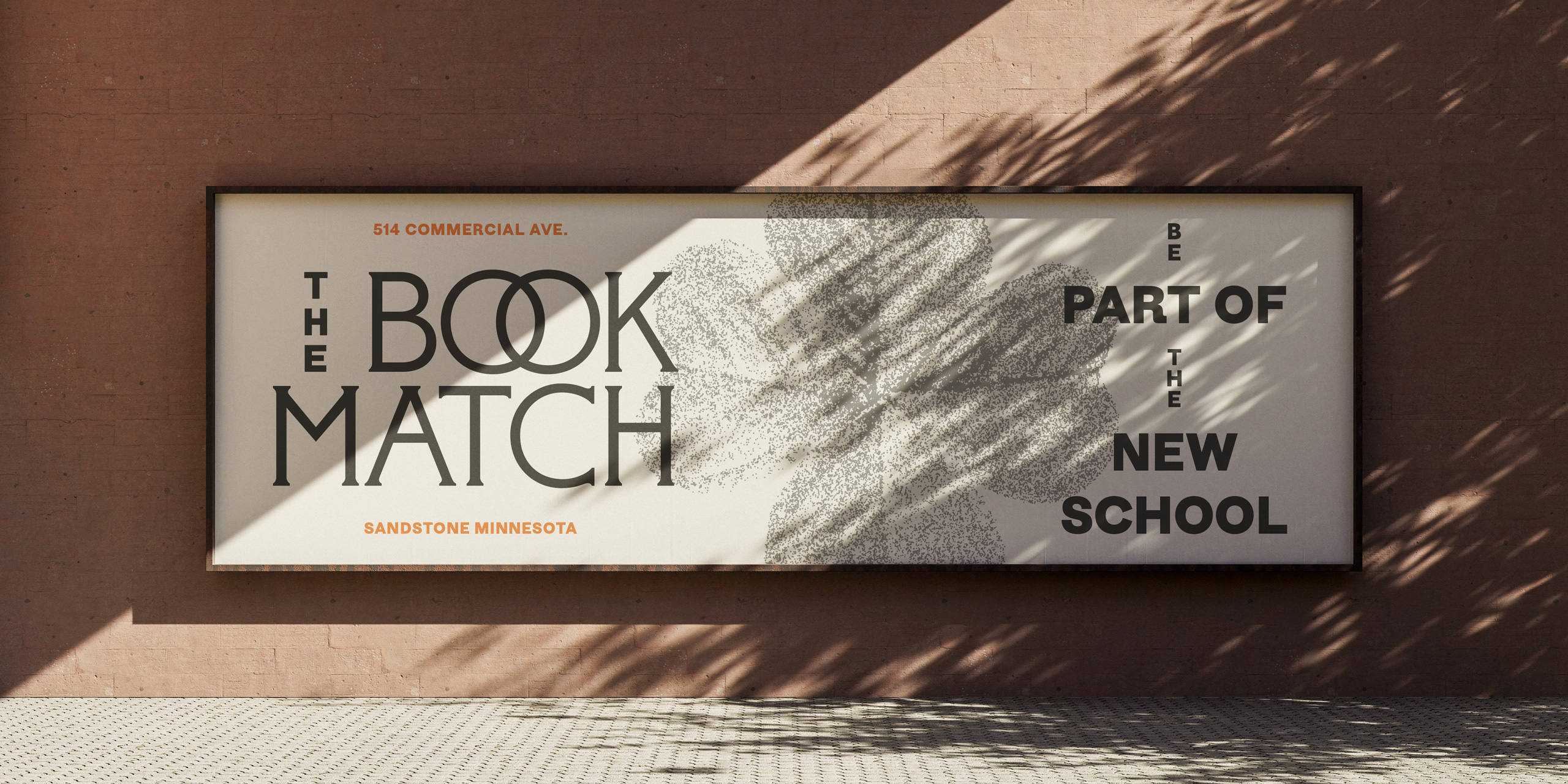
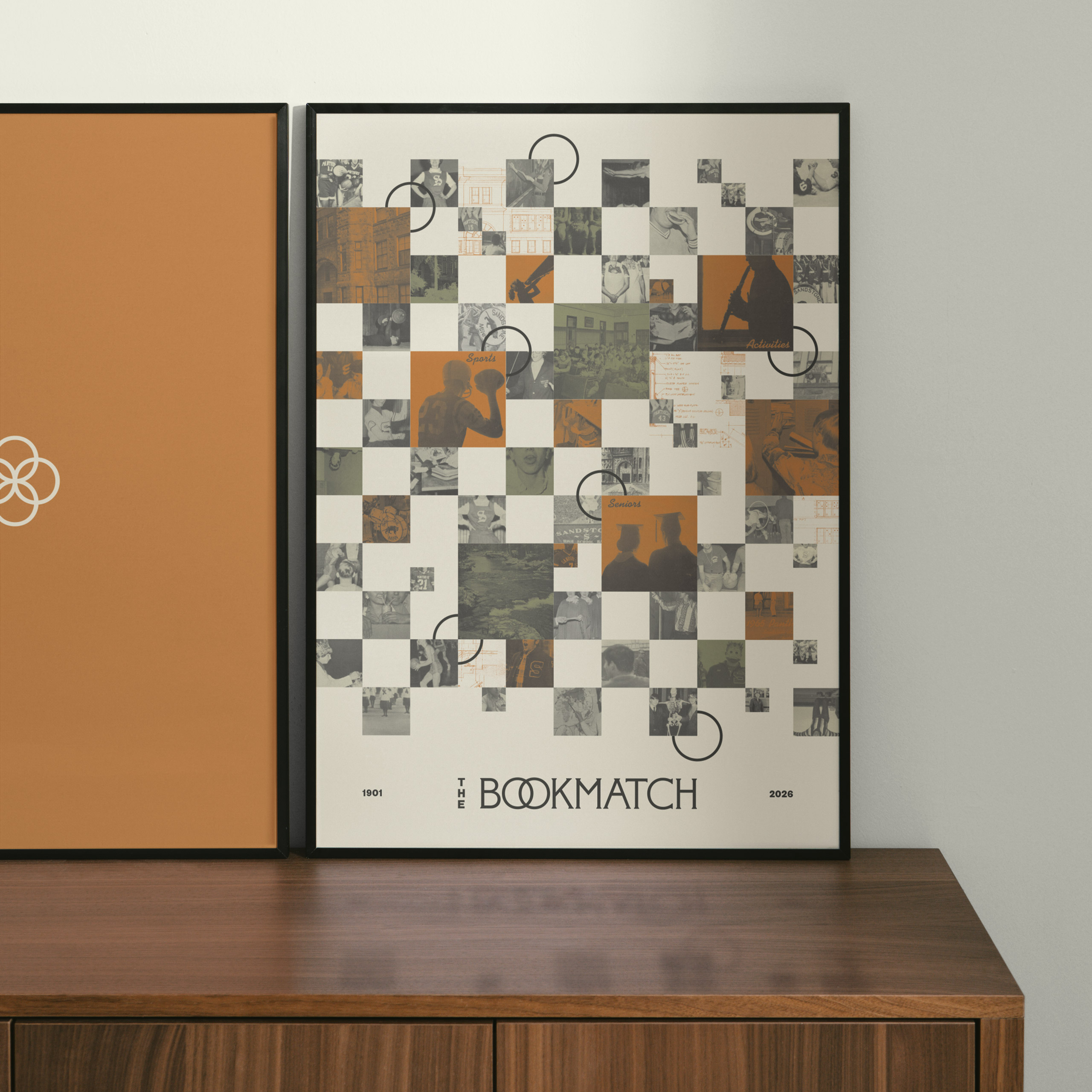
In Sandstone, Minnesota, an abandoned high school was redeveloped into much-needed housing for its growing population. We took inspiration from both past and future to reposition this local icon for its next century. Key architectural details were repurposed into a brand system that pays homage to the school’s history and invites new residents.
The name draws from “bookmatching,” the process of splitting and mirroring wood or stone—in 1910, the school was expanded after a devastating fire by simply flipping the original blueprints. From the overlapping and distinct letters of the cornice came the wordmark. The brand icon was inspired by clover shapes found carved in the banisters, and recontextualized to symbolize the overlap between past and future.
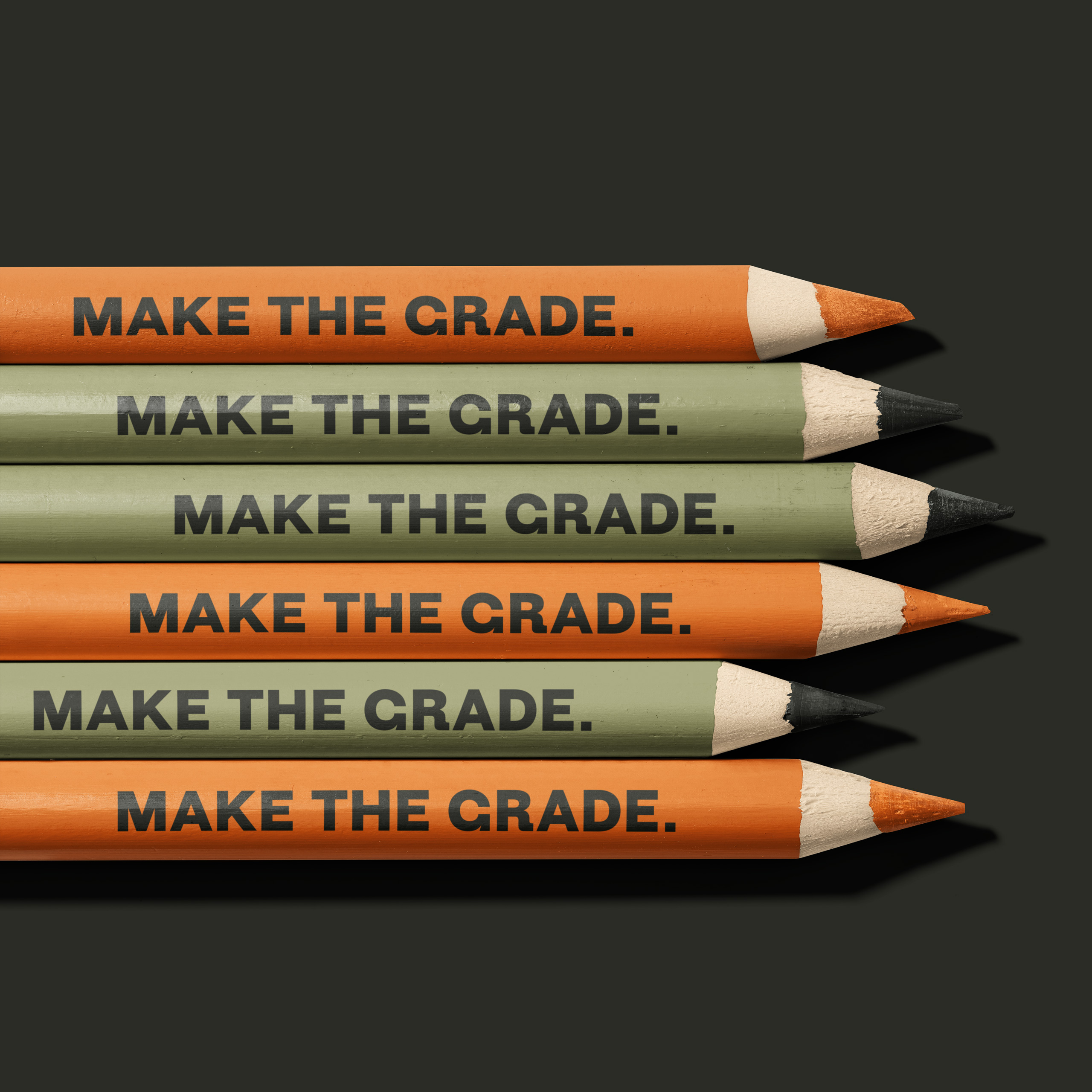
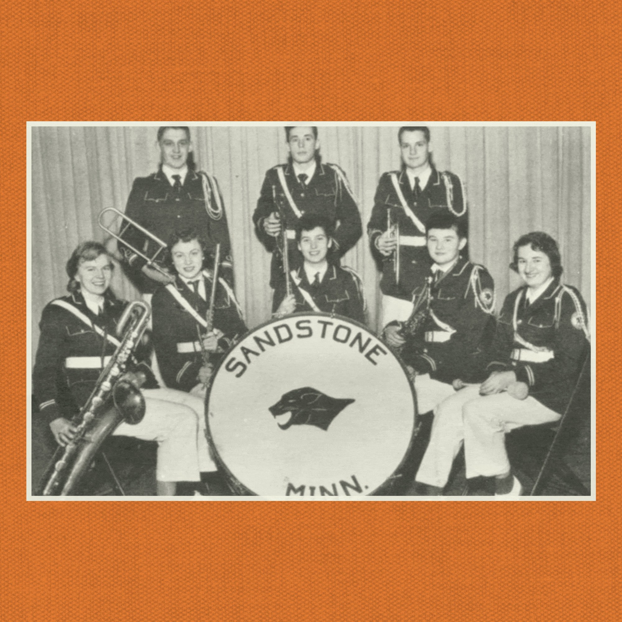
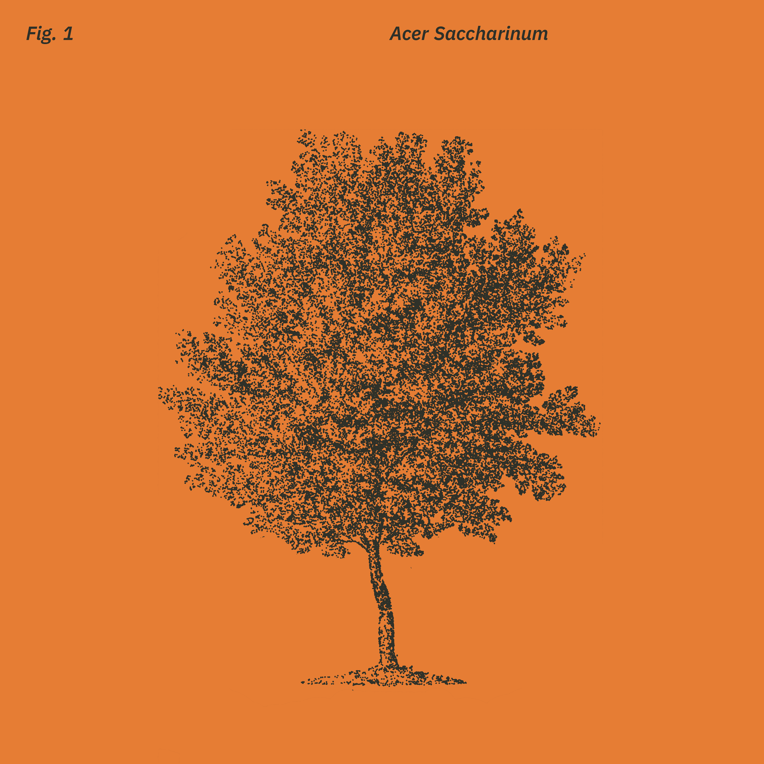
Layouts leverage the symmetrical concept with stacked typography, along with balanced imagery (pulled from local and academic symbols) stylized like old schoolbook illustrations.
2026
Made at Fellow Inc. With Annalise Groff, Eric Luoma, and Karl Wolf