

The Bookmatch Process
↘ View Project
Background
Adaptive reuse developer New History partnered with the City of Sandstone to create much-needed housing. The Bookmatch (formerly the historic Sandstone School) will house 32 apartments in 39,000+ square feet.
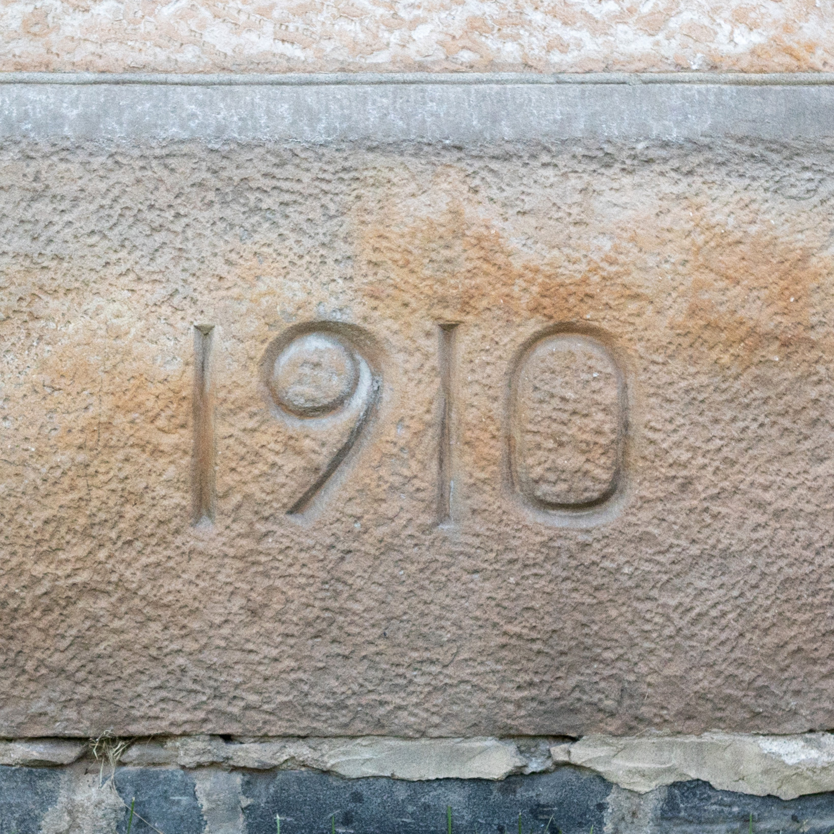
Construction of “The Rock” first took place in 1901 using sandstone from the nearby Kettle River quarries. It was rebuilt in 1910 after lightning struck and destroyed the inside—from practicality and necessity, they simply flipped the blueprints, doubling the size of the building.
The school served generations of students, but had sat empty for decades. Its extensive renovations were set to welcome a new clientele.
Branding
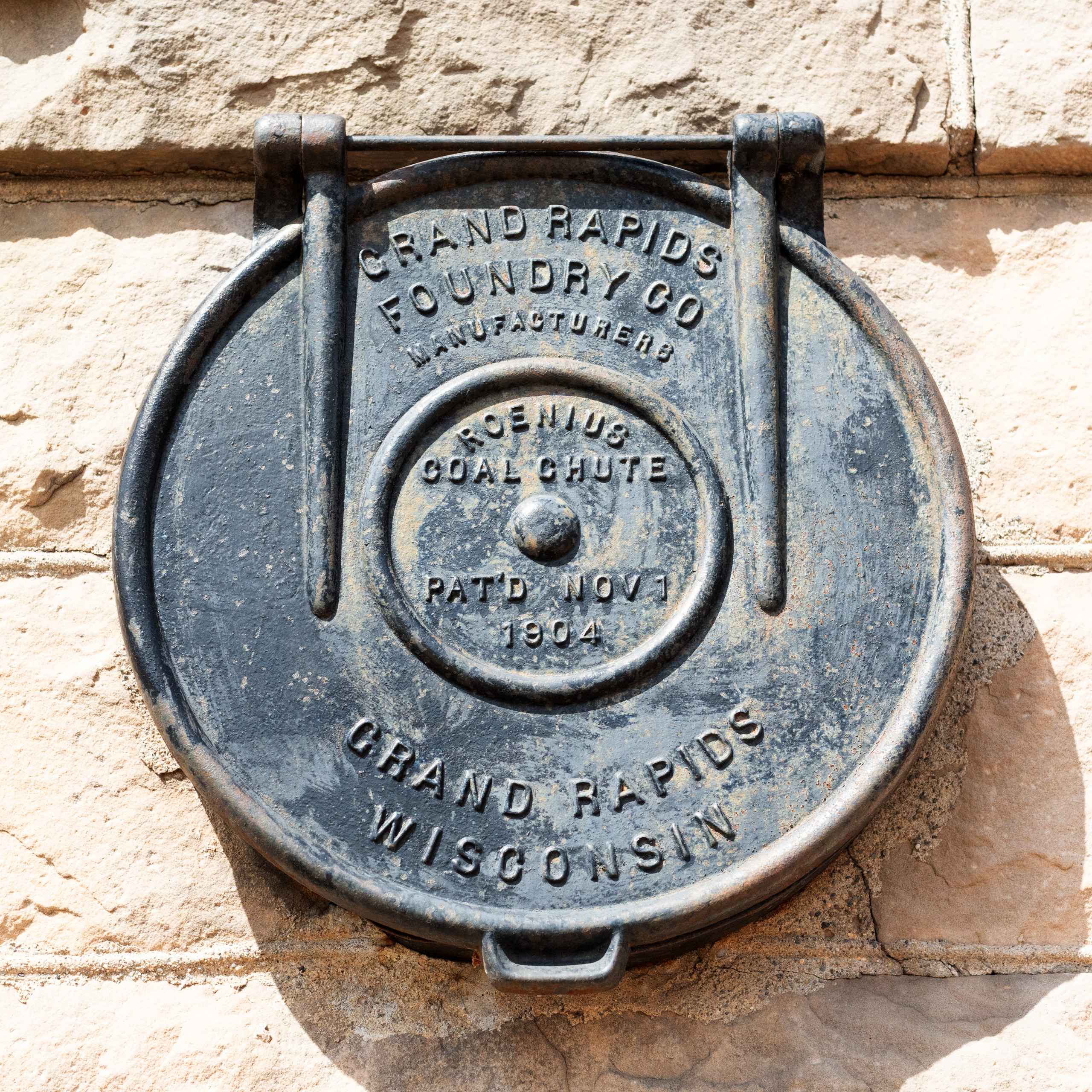
With its history as a school, academic references felt too obvious. What’s meant as tribute quickly becomes saccharine nostalgia. To bring in 21st century residents that had never set foot in the building (or even the town), we chose instead to focus on the handcrafted details of the architecture.
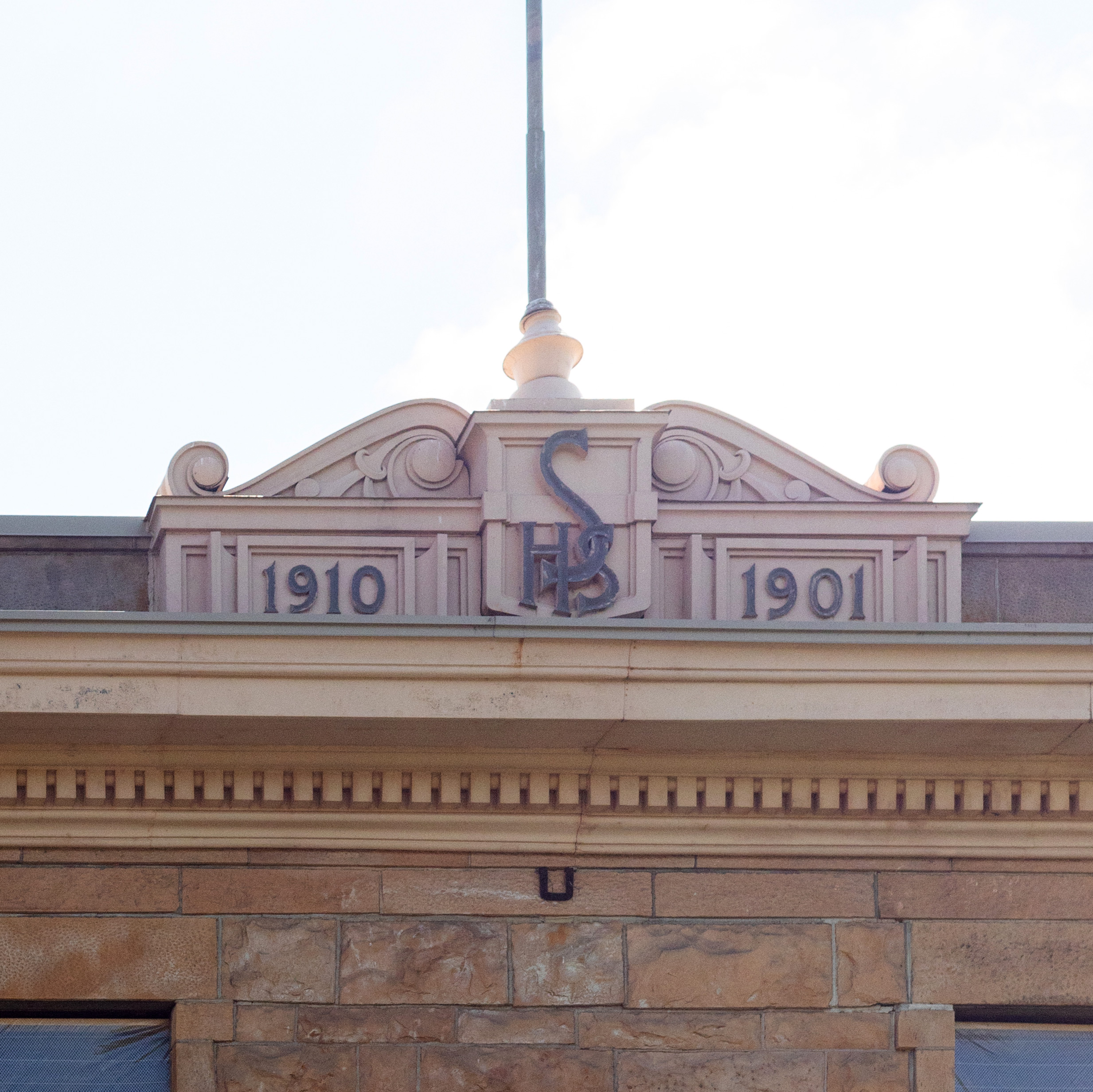
The primary wordmark is inspired by the DNA of the “SHS” lettering in the building’s cornice: a high X-height, interlocking letters, and carefully chiseled serifs. Montecatini by Tipofili was a great starting point; the lettering was then intentionally balanced to evoke the building’s namesake technique of bookmatching. The “the” references the flagpole.
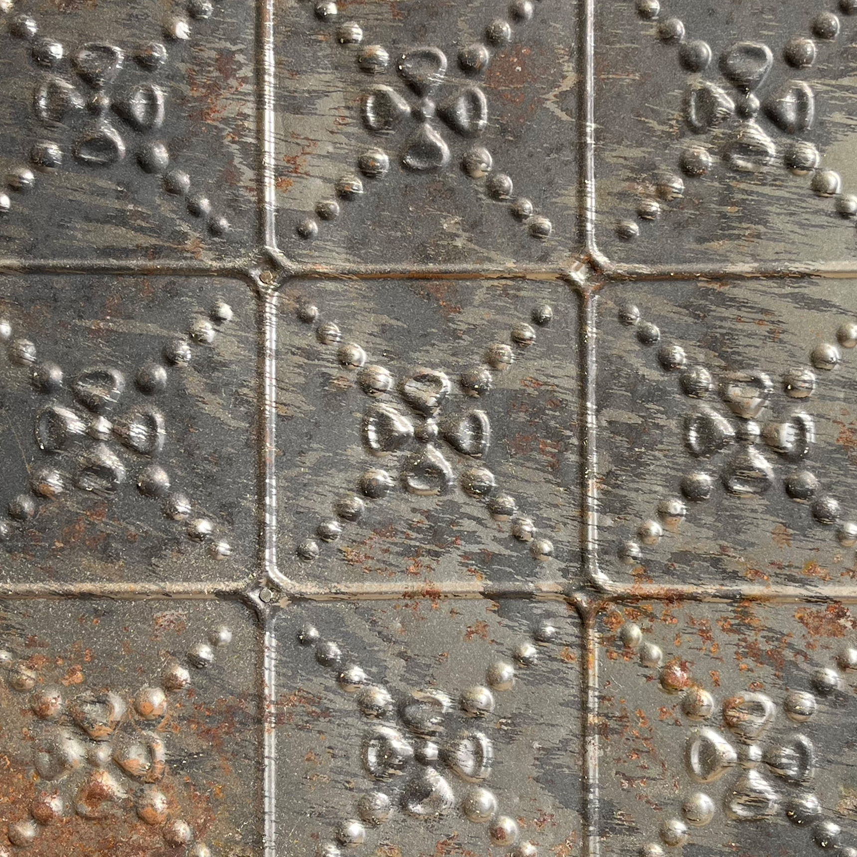
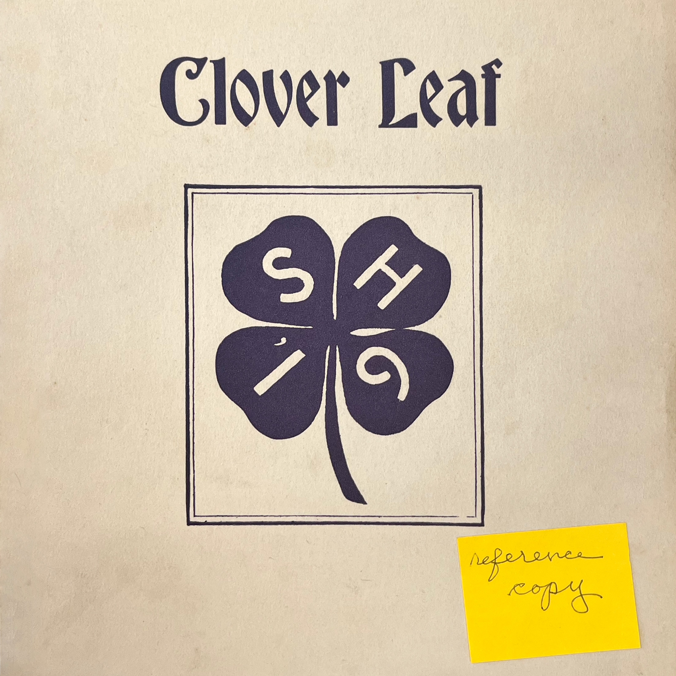
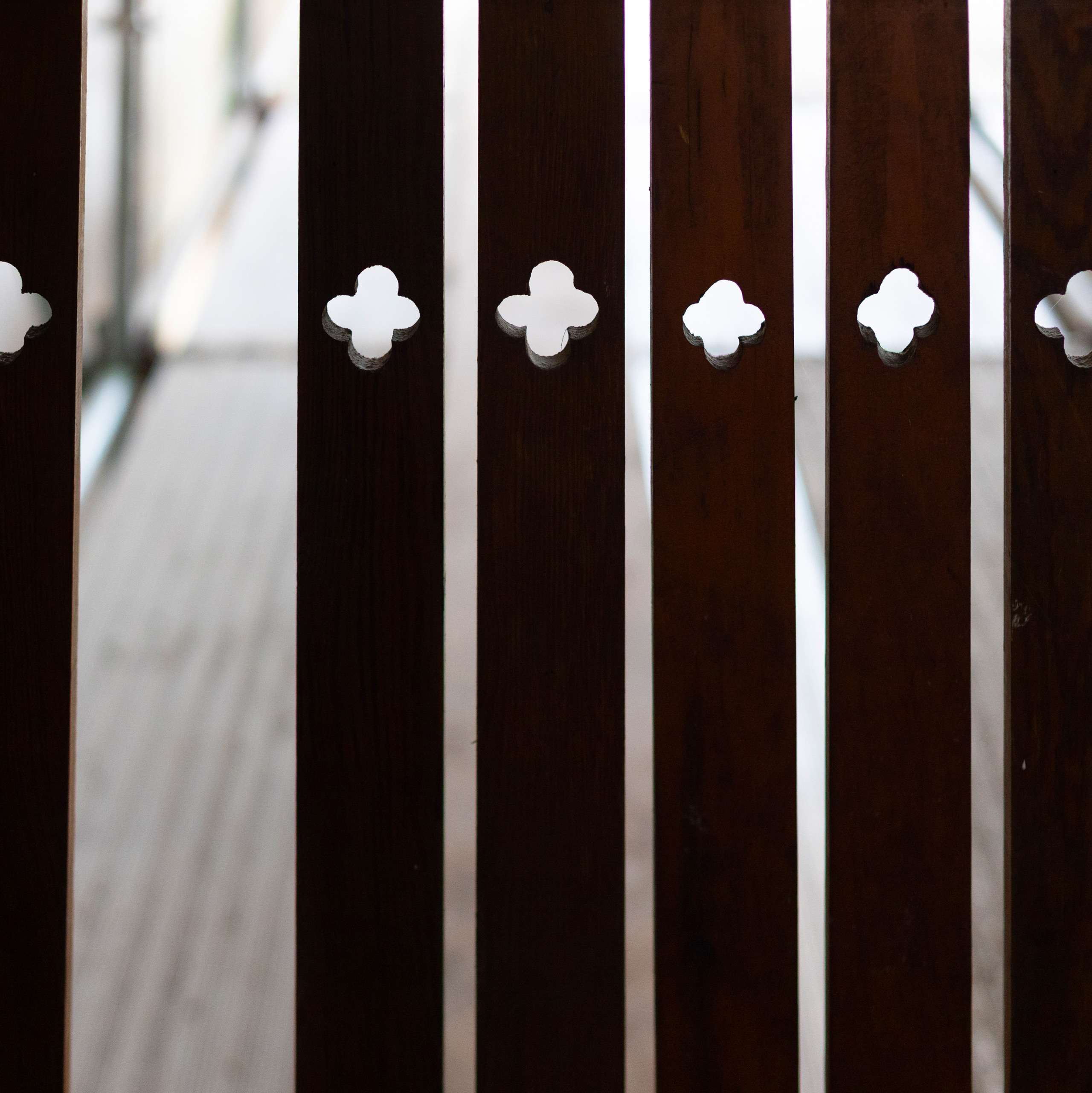
The clover leaf was a mysterious symbol from throughout the building’s history. It was titling 1920s yearbooks, pressed into ceiling tiles, and hand-drilled into every banister on the staircases. Nobody knew why. Flipping the overlapping Os of the wordmark created a blueprint of that hand-crafted detail.


Typography
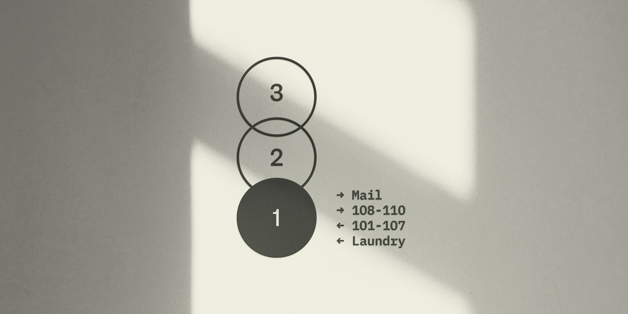
The Bookmatch’s primary typeface is Proto Grotesk. Drawing from early sans serifs used in advertising, Proto Grotesk revives an era when handicraft was a virtue.
IBM Plex Sans is the secondary typeface. IBM Plex’s engineered form reflects classic industrial design—like the Selectric Typewriter and school bells—that had filled the halls of Sandstone High School.
Imagery
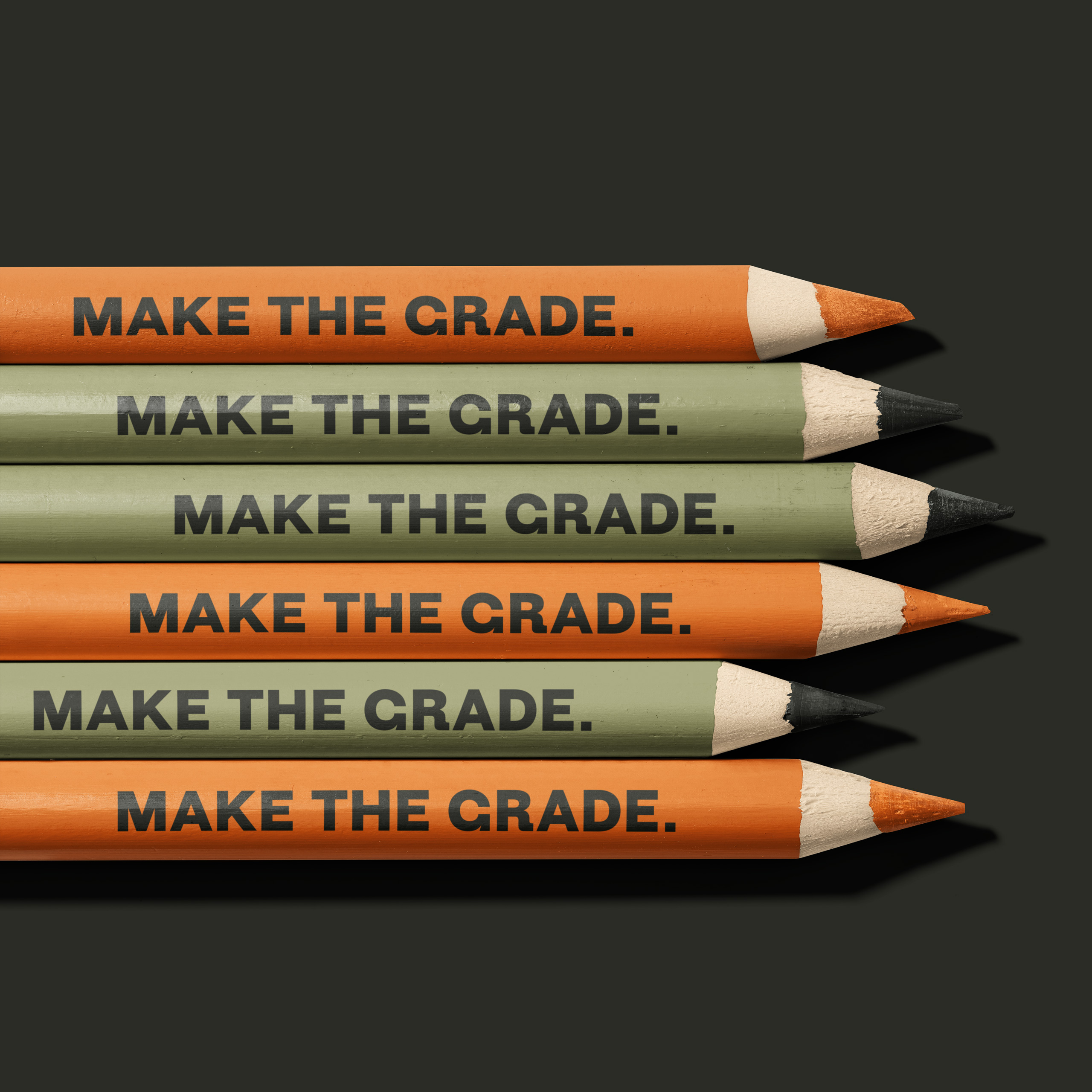
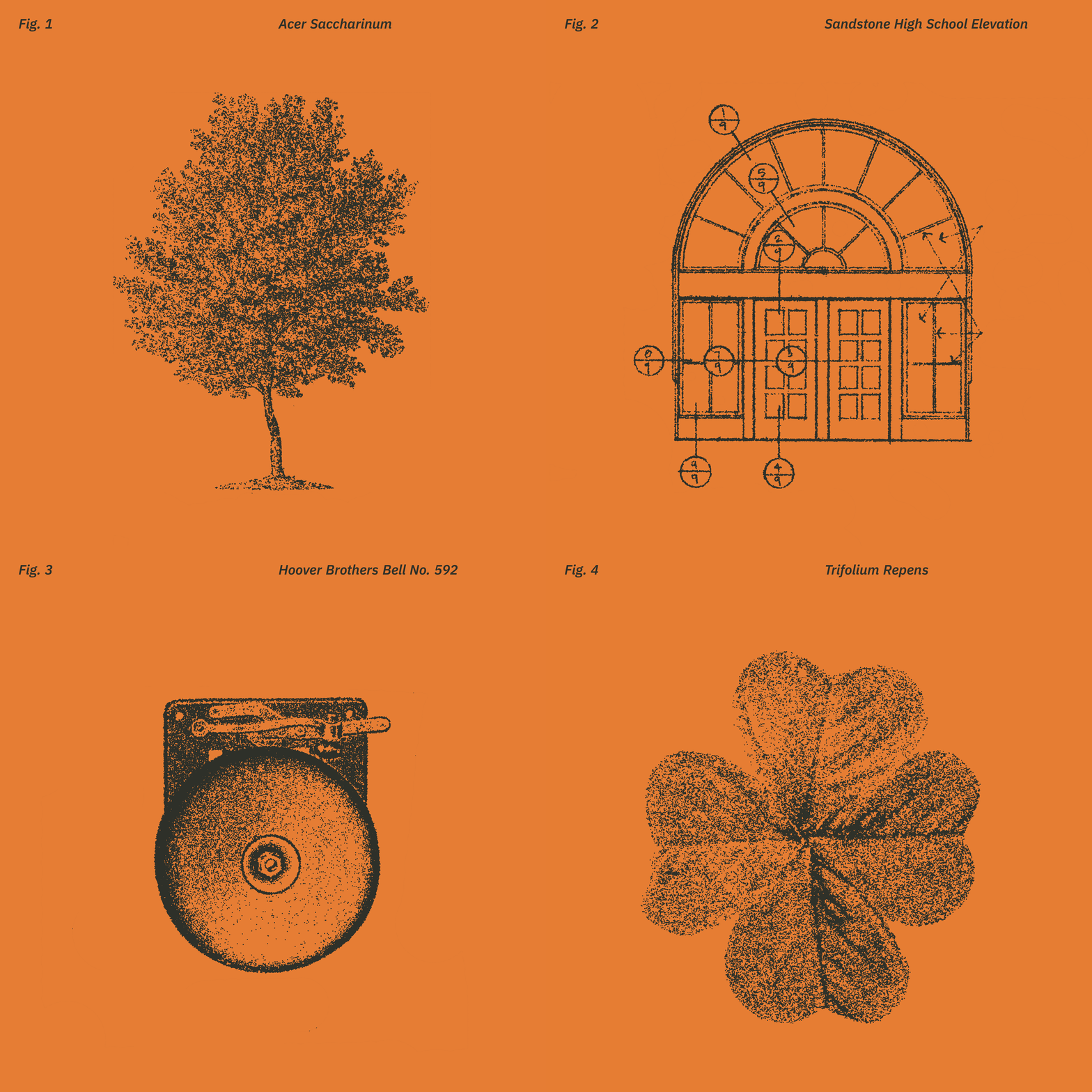
In the educational spirit, we sourced public domain imagery for use in the broader visual language.
Symmetrical (“bookmatched”) images were extracted from sources like midcentury school supply catalogs, field guides of the area’s natural life, and the school’s blueprints. They were then custom-rendered as a set to look like they were scanned in from old books.
Change Management
While it was most important to paint a vision of the school’s future, a project like this demands a certain level of respect for its past.
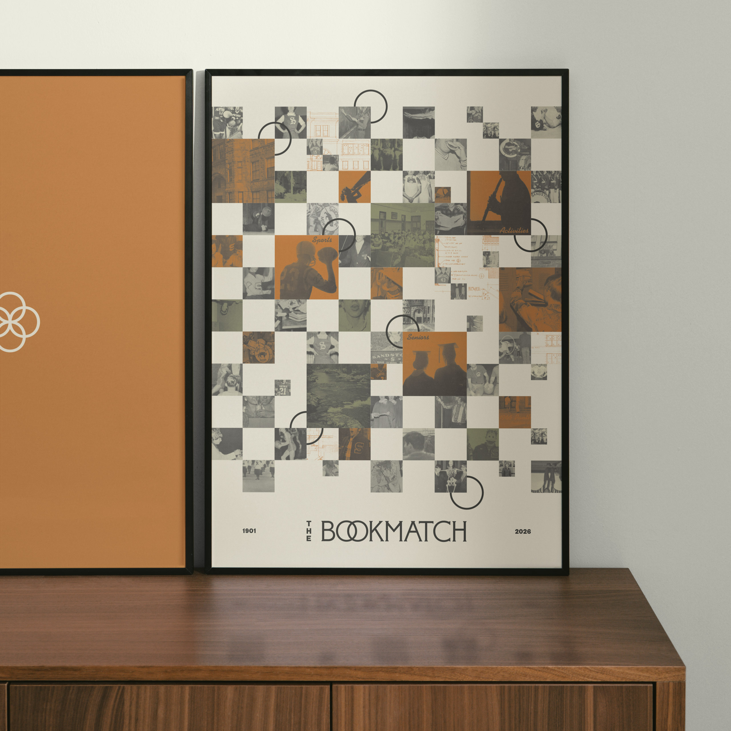
We worked with local leaders to ensure the brand could flex to showcase the school’s history in a unique way. A commemorative poster for new residents pulls vignettes directly from nearly a century of Sandstone High School yearbooks. The clover leaf/double-O shapes are recontextualized to link past and present.
Bibliography
Video and building blueprints c/o Jillpine / Gardner Builders
Historical documents c/o Sandstone History Museum
Site photos c/o Annalise Groff