Aluminaire House Process ↘ View Project
Approach
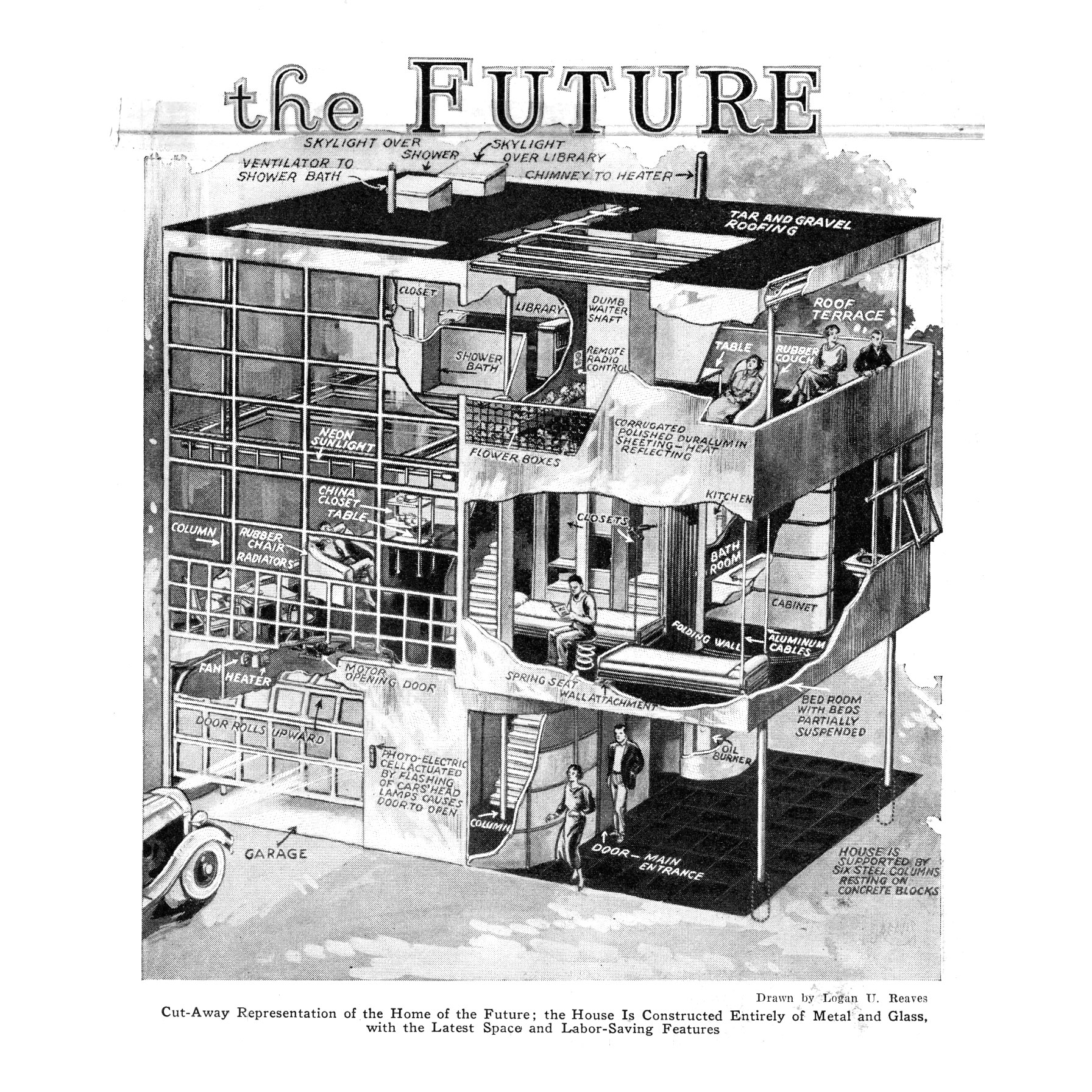
What feels futuristic now is often anachronistic with what the perception of the future actually was in the past. “Modernism” as an aesthetic is nowadays often conflated with 1960s–1970s corporate design; but earlier in the 20th century, modernism as a movement was founded on an optimisitic vision for the future.
As Adam Lerner, executive director of the Palm Springs Art Museum puts it:
“Here in Palm Springs, we often associate modern architecture with luxury, style and elegance...But with the Aluminaire House, we are reminded that modernism is not just a style but an embodiment of ideas. Modernism is about making good design available to a wide audience.”
The project had to be viewed through this lens of how the architect envisioned Aluminaire House, rather than a retroactive idea of what “the future” looks like. Less Space Age, more Whole Earth Catalog.
Typography
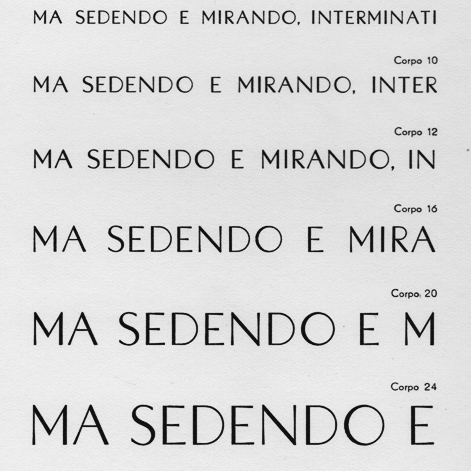
Initial exploration into contemporaneous typefaces yielded some obvious solutions such as Futura, released in 1927. Florida was a better candidate, designed by Hans Möhring in 1931, the same year the house was first built. It blends precise geometry with a luxury feel.
With only a few true revivals available, our face of choice was F37 Bergman. Anticipating use in signage and other collateral, its lowercase range and beautiful numerals stood out.
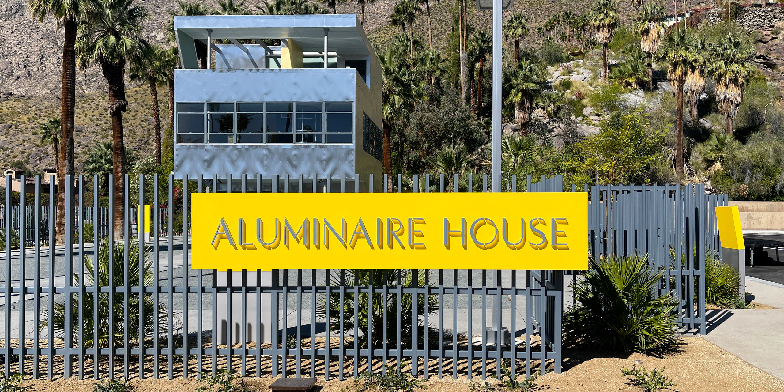
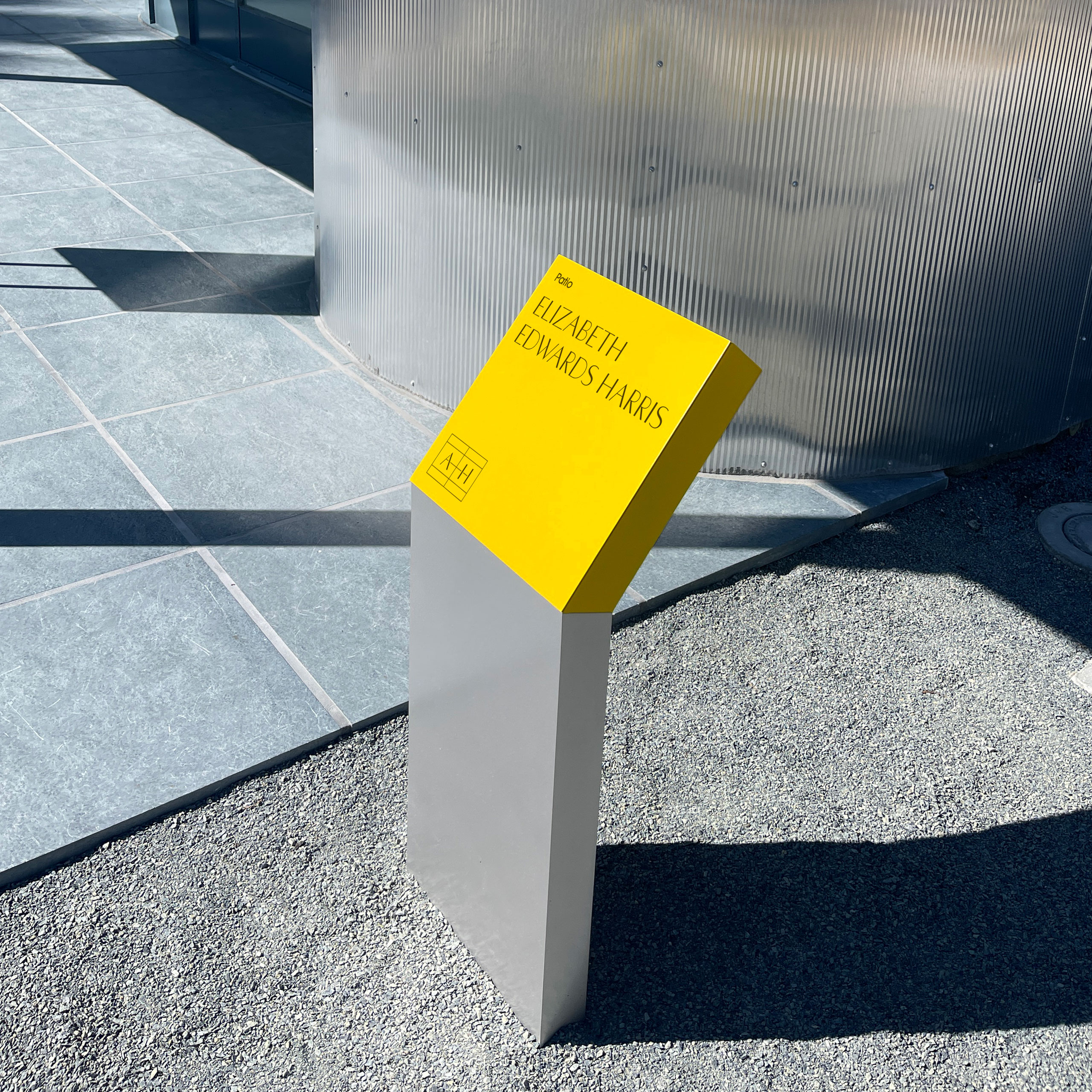
To balance the typeface’s elevated feel and add an architectural touch, we modified the type with a stencil treatment in the house’s primary wordmark. Echoing some of the fine lines in the house windows, this also made for unique dimensional lettering on the monument sign.
Color
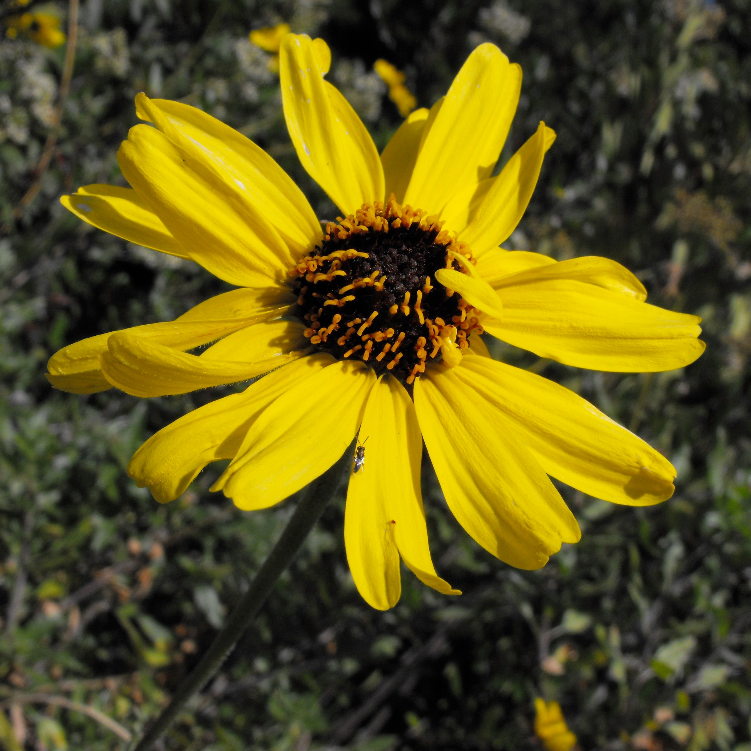
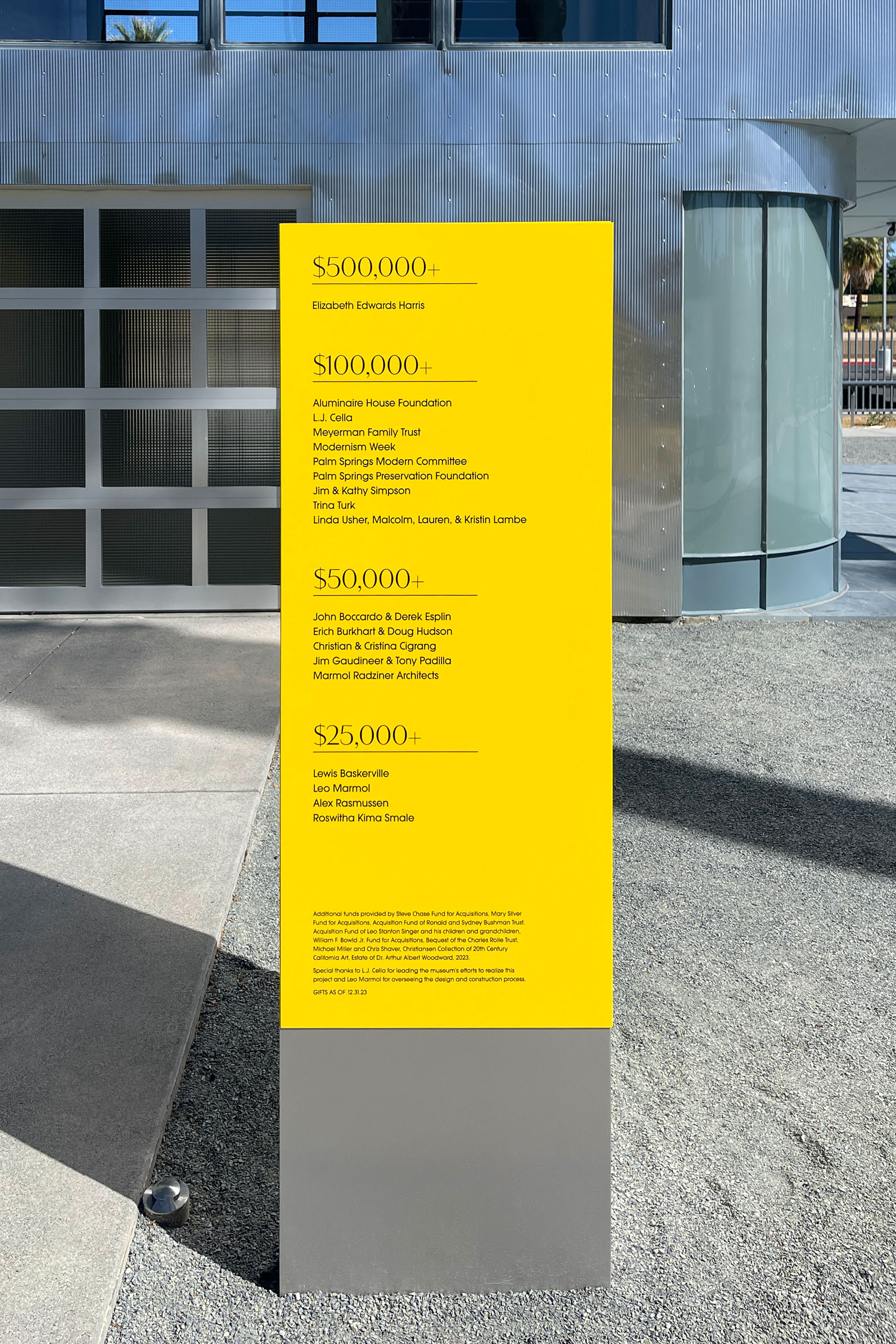
Frey’s work often featured saturated yellows and aquas contrasted with basic, industrial materials like stone and glass. The house exterior is mostly plain aluminum, functioning as the raw material. Signage was an opportunity to add bursts of color, creating a unique experience on-site that guides visitors around the structure.
Since the physical environment was the most important aspect of the identity, we worked backwards from paint swatches. Of course, color is important with paints; but in the harsh desert of Palm Springs, durability is a key factor to survive. Working with a local fabricator, we matched Matthews Paint “Lamborghini Yellow” to other finishes in Frey’s work throughout Palm Springs. His love of the color came from the local brittlebrush (encelia farinosa) flowers.
Wayfinding
With the house already a stark material object, the signage system had to be even starker to not overpower. Echoing Frey’s use of color and finish, we created a modular system of powder-coated aluminum panels that paired with unfinished aluminum bases.
Strategically placed around the structure, we created a traffic flow that encouraged visitors to stop and view the house from different angles, anchored by key donor moments.
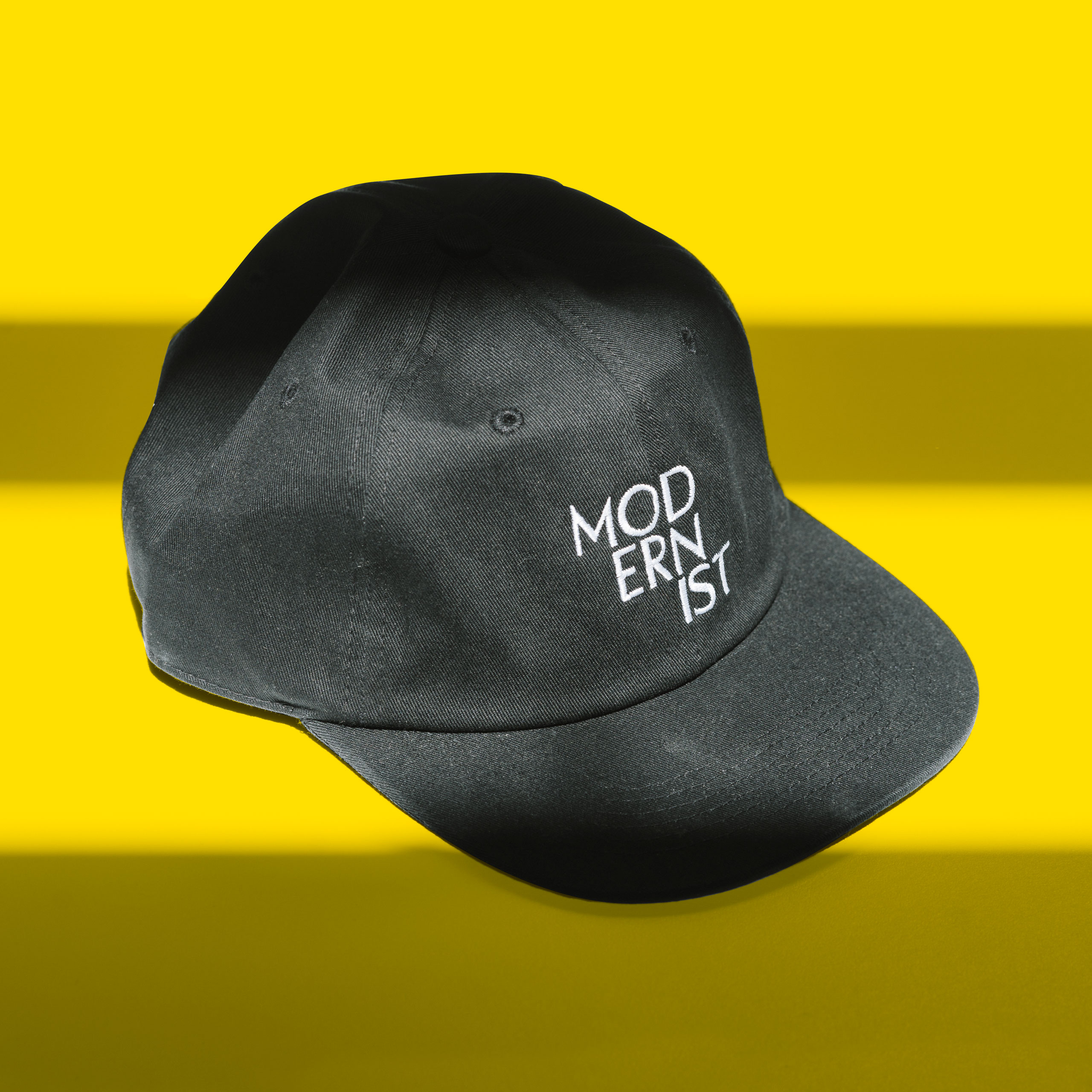
Merch
We’ve all seen enough boring museum merchandise. Our goal with these pieces was to spread the gospel just as Frey wanted to in 1931: boldly declare yourself a modernist, celebrating the innovation intrinsic to that.