

AirGo Radio Process ↘ View Project
Groundwork
Digital media like podcasts are the zeitgeist of broadcast. However, they’re often disconnected from the history and craft of legacy media; relegated to their own modern, lesser tier. Invoking history was key to tap into for AirGo in order to contextualize their work for the future.
Typography
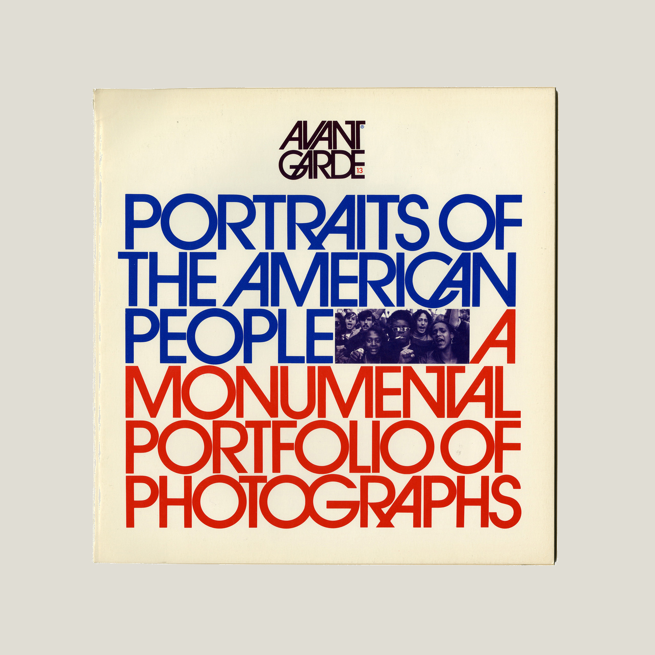
Herb Lubalin is one of my favorite designers of all time. The origin of ITC Avant Garde made it a great candidate to illustrate a more expressive modernism. Lubalin brought unparalleled craft to media design throughout his career, especially with independent magazines like Avant Garde, Eros, and Fact; as well as in work for PBS Television and the Saturday Evening Post.
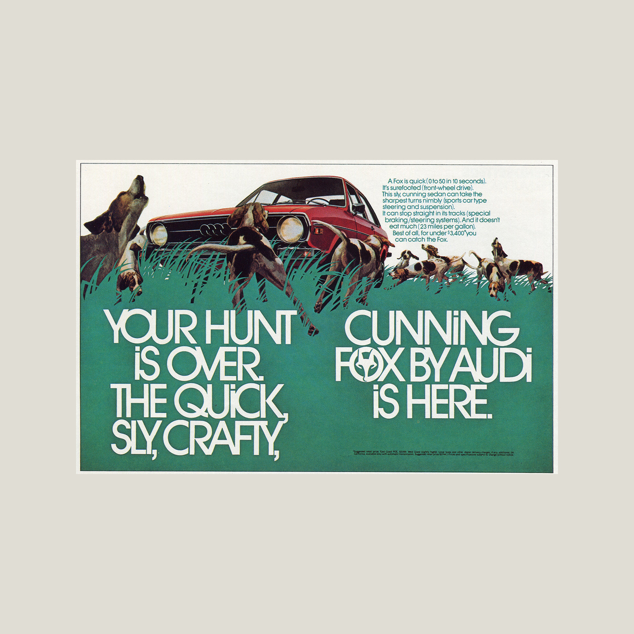
To to use his typeface properly, I needed to live up to Lubalin’s words for Helmut Krone’s typesetting for Audi (bottom image):
“I often wonder whether the world wouldn’t be a better place to live in without Avant Garde Gothic. But then, you come up with these beautifully designed Audi ads, and it gives me renewed confidence in my ability as a type designer. I wish more people would show your kind of concern and understanding of type.”
Challenge accepted.

Not Just A Typeface
Beyond its more radical print origins, Avant Garde found life in many other forms of media.
The typeface was used as a key part of Lubalin’s identity for PBS in 1971, when the organization had to recalibrate and strengthen its visual identity for continued expansion as a national broadcaster (just like AirGo Radio). When the identity was evolved in 1983 by Chermayeff & Geismar, they shifted to the slab serif version of Avant Garde, Lubalin Graph.
Avant Garde was also used in artwork for musicians including Aretha Franklin, Miles Davis, and, Charles Mingus, as well as in the identity for audio equipment brand Canton.
Synthesis
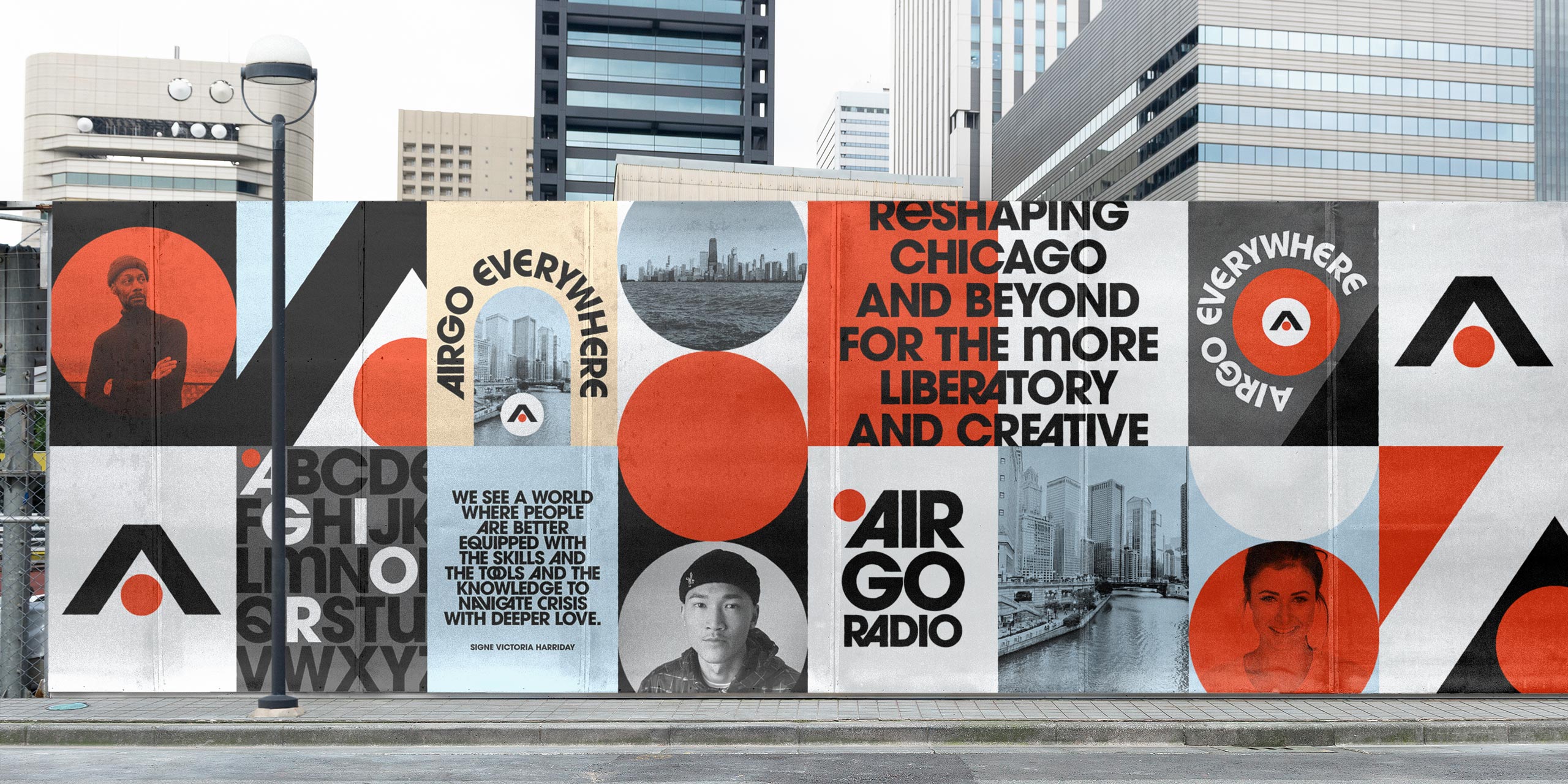
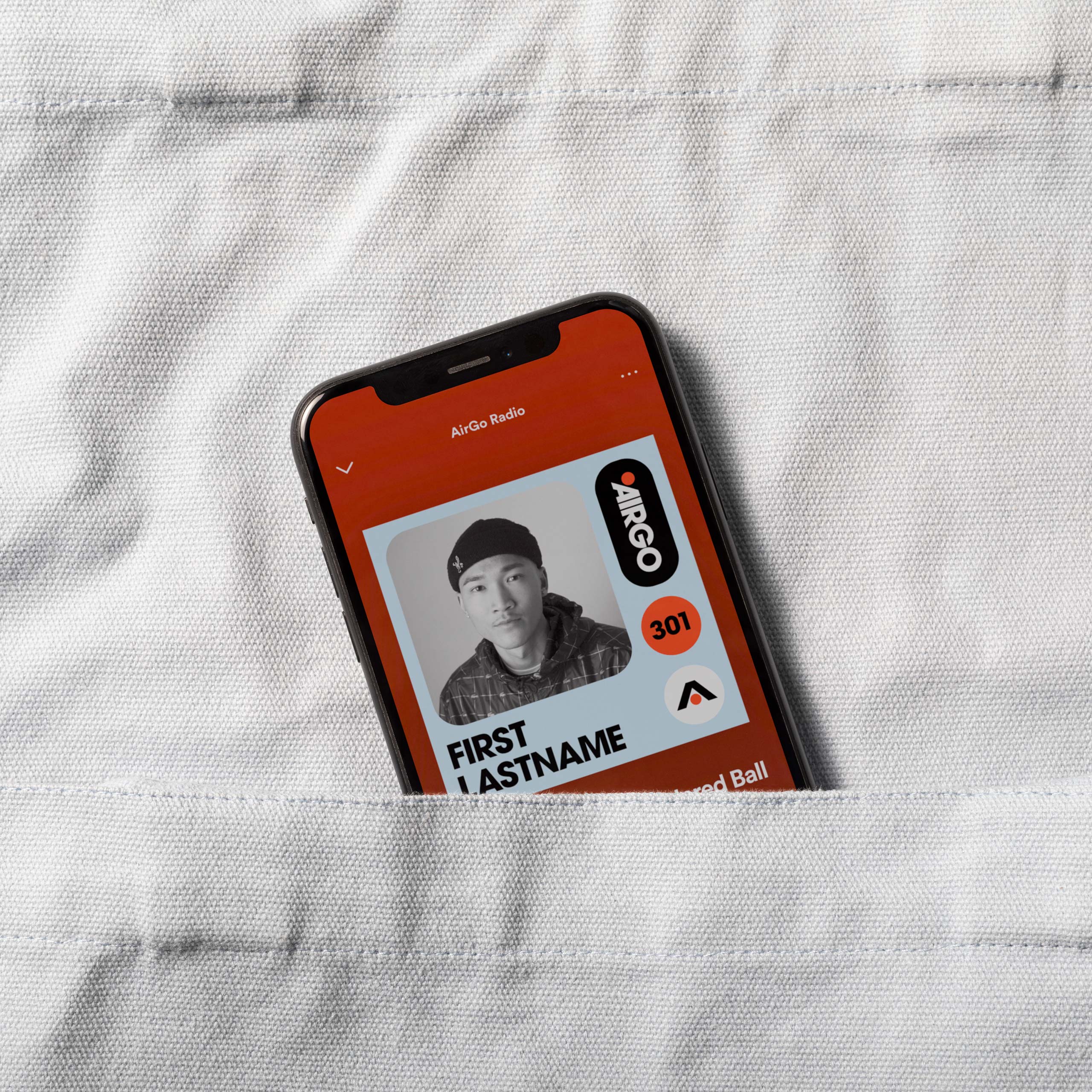
Obviously, Herb Lubalin’s work was deeply informative both in style and medium. Rooted in typographic and editorial expression, but still balanced by a strategic visual system. Since this was a system to hand off to a small team, we needed to balance that expression with utility.
A modular layout system played off of the geometry of the hero typeface and symbol while giving structure to podcast’s variety of content.
Bibliography
Is Avant Garde Gothic, Avant-Garde? (the Herb Lubalin Study Center)
Public Means People: Herb Lubalin and Chermayeff & Geismar’s Logos for PBS (Logo Histories)
Eros, Fact and Avant Garde (Design is History)